Learn how get great results using light and color in your composition. This photography tutorial will give you an understanding about tonal contrast, Rembrandt lighting, basic color theory, and more.
What I want to focus on today though is, how you can achieve intriguing results by composing your shots with light and color. The things we're going to talk about today are meant to give you a lead on how you can creatively make use of a better sense of understanding of light and color to create unique, unconventional, and dramatic compositions that can set you apart from the rest.
Light is the very essential part of photography. Without light there is absolutely nothing. No matter how sophisticated your gear is, how large your sensor is, how long your lens is, it all comes down to light entering the camera traveling through the lens and registering onto photographic film or digital sensor.
Every photographer, regardless of their level of expertise, study the light characteristics of their scene; how harsh or soft, how cold or warm, how high or low, and so on before making the decision of how to pursue.
On the other hand, color is also a very important component of a successful composition. Photographers, unlike painters, find colors rather than create them (at least for the most part!), and this is why they are less informed of color theories, how to use them, and how to intensify existing colors to better serve their needs. Nevertheless, photographers are well served understanding the basics so that they can appreciate why some color images work while others don't.
To be honest, color is a huge subject of its own that no post or a dozen can give justice to. However, we are going to be looking at the fundamentals of color that can assist us to better understand how we can make the best of it in our photos, and how to utilize it to convey the intended emotional and perceptual responses of our photos.
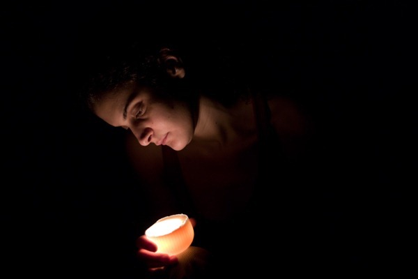
That said, light and dark areas in an image strongly contribute to the feel and mood of it. When the photo is mostly dark, favoring shadow tones, it is low key. When a photo is mostly bright, favoring light tones, it is high key. Maximum contrast demands more or less equal areas of black and white.
The level of brightness (key) in an image differs in monochromatic photos from that in color photos. High key is generally harder to achieve or be accepted in a color photo, mainly because of the realism of color photography. When a color photograph is high key, sometimes it's conceived as being over-exposed or washed out.
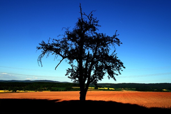
Exposing your photo for the highlights (making sure you record the brightest tone in the scene having it just touching the right side of the histogram with no clipping occurring, regardless of the state of the shadows in the photo) adds contrast to a photo and causes colors to appear more saturated and intensified. Sometimes if shadows become much under exposed, ambiguity masks the photo which might give it appeal and create drama under the right circumstances.
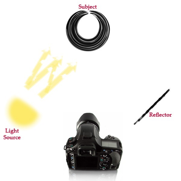
Rembrandt lighting, also called chiaroscuro, is achieved by having the subject illuminated by two light sources with differing intensity, or with one light source and a reflector.
The prime light source is placed to one side of the subject at the front, with the other light source or reflector placed half-height to the opposite side. This technique is widely used in portrait photography due to its low cost equipment and intriguing results.
It is worth mentioning that there are two types of colors; subtractive and additive. Each type has two sets of its own; primary colors, and secondary colors. Painting, photography, and printing use subtractive colors, and this is our concern in this post. Primary subtractive colors are red, yellow, and blue.
Red is conceived as the strongest and most intense. It tends to advance, and this is why when placed in the foreground adds depth and dimension to a photo. It is perceived as passionate, dangerous, and sometimes hot.
Yellow is the brightest of all colors. It is perceived as dynamic, sharp, persistent, and sometimes cheerful.
Blue recedes more than yellow. It is often perceived as calm, cool, and even aerial due to its common association with the sky.
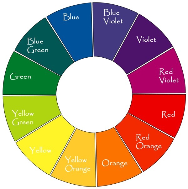
From these primary colors secondary ones emerge, which are: green, violet, and orange. Merging every two consecutive primary colors from the above color wheel produces the secondary color in between. So mixing red and yellow produces orange, mixing yellow and blue produces green, and mixing blue and red produces violet.
Pairs of colors that fall opposite to each other on the above color wheel are called complementary colors. These pairs complement and intensify one another when put together, through what is known as Simultaneous Contrast. Studying the color wheel can give you a better understanding as to how colors affect or complement each other, so that you can use this knowledge to better prevail the correct meanings and messages in your photography.
Varying the exposure varies the brightness and intensities of colors. At the same time, some colors can only exist in different ranges of brightness. Yellow for example cannot be too darkened, or else it changes to a different color such as ocher. Orange turns to brick-red when under exposed. Purple turns violet when under exposed. Blue on the other hand preserves its blueness under varying exposure conditions. Generally yellow is the brightest hue when fully saturated, and violet is the darkest hue when fully saturated.
It's important to keep these facts in mind if you're exposing for color. Being aware of how different colors change intensities under different exposures will help you make the best out of your color photo that is, of course, if your main intention in the composition is color.
If you're in a situation with varying colors which characteristics are going to be clashing under whichever exposure you decide to go with, it helps to determine your main color or tone in the image and adjust your exposure to retain that.
Black and white is a form of art like no other. It starts with documenting the reality around us, but it is stripped of all color to stand on its own two feet triggering emotions and perceptual responses which would not have been made possible otherwise.
The lack of color in monochrome photography gives a whole new degree of importance to form, shape, and texture in a photograph and it makes the urge to frame a successful composition even more essential.
It's also worth mentioning that, black and white photography lends itself well to extreme variations in exposure to create mood and drama. That is because, with black and white there is not the downside of changing colors and shifting hues under varying exposures, which is a thing that becomes of concern in color photography.
Composing with Light and Color
There are many articles, blogs, and even whole books out there discussing how to record a composition, and introducing you to the most known and famous rules or guidelines of composition such as the rule of thirds, converging lines, looking for patterns, utilizing surrounding texture, filling your frame, and on and on and on... and I 100% agree with all that. In fact, these are the ABCs of photography, and whether you choose to follow or break those rules, you should be familiar with them to begin with.What I want to focus on today though is, how you can achieve intriguing results by composing your shots with light and color. The things we're going to talk about today are meant to give you a lead on how you can creatively make use of a better sense of understanding of light and color to create unique, unconventional, and dramatic compositions that can set you apart from the rest.
Light is the very essential part of photography. Without light there is absolutely nothing. No matter how sophisticated your gear is, how large your sensor is, how long your lens is, it all comes down to light entering the camera traveling through the lens and registering onto photographic film or digital sensor.
Every photographer, regardless of their level of expertise, study the light characteristics of their scene; how harsh or soft, how cold or warm, how high or low, and so on before making the decision of how to pursue.
On the other hand, color is also a very important component of a successful composition. Photographers, unlike painters, find colors rather than create them (at least for the most part!), and this is why they are less informed of color theories, how to use them, and how to intensify existing colors to better serve their needs. Nevertheless, photographers are well served understanding the basics so that they can appreciate why some color images work while others don't.
To be honest, color is a huge subject of its own that no post or a dozen can give justice to. However, we are going to be looking at the fundamentals of color that can assist us to better understand how we can make the best of it in our photos, and how to utilize it to convey the intended emotional and perceptual responses of our photos.
Light and Key
One important element that supports a successful composition is contrast, and most importantly tonal contrast. Tonal contrast is the difference between the highlights and the shadows in a photograph. The greater the difference, the more contrast a photo is said to have. Tones in between are known as the midtones,and are where most information in a photo lies.That said, light and dark areas in an image strongly contribute to the feel and mood of it. When the photo is mostly dark, favoring shadow tones, it is low key. When a photo is mostly bright, favoring light tones, it is high key. Maximum contrast demands more or less equal areas of black and white.
The level of brightness (key) in an image differs in monochromatic photos from that in color photos. High key is generally harder to achieve or be accepted in a color photo, mainly because of the realism of color photography. When a color photograph is high key, sometimes it's conceived as being over-exposed or washed out.
Exposing your photo for the highlights (making sure you record the brightest tone in the scene having it just touching the right side of the histogram with no clipping occurring, regardless of the state of the shadows in the photo) adds contrast to a photo and causes colors to appear more saturated and intensified. Sometimes if shadows become much under exposed, ambiguity masks the photo which might give it appeal and create drama under the right circumstances.
The Rembrandt lighting technique
Rembrandt lighting is a technique used in photography and cinematography to create distinct areas of light and shadow in a photo, giving it mood and compelling emotion. It is distinctly used in studio portrait photography, and is achieved by having one side of the subject well lit while the other side underexposed evoking the emerging interactions between light and shadow to create appeal.Rembrandt lighting, also called chiaroscuro, is achieved by having the subject illuminated by two light sources with differing intensity, or with one light source and a reflector.
The prime light source is placed to one side of the subject at the front, with the other light source or reflector placed half-height to the opposite side. This technique is widely used in portrait photography due to its low cost equipment and intriguing results.
Color
Color adds a whole new dimension to photography, and the more it is saturated the greater role it plays in the overall feel of an image. The most important color characteristics are: hue, saturation, and brightness.It is worth mentioning that there are two types of colors; subtractive and additive. Each type has two sets of its own; primary colors, and secondary colors. Painting, photography, and printing use subtractive colors, and this is our concern in this post. Primary subtractive colors are red, yellow, and blue.
Red is conceived as the strongest and most intense. It tends to advance, and this is why when placed in the foreground adds depth and dimension to a photo. It is perceived as passionate, dangerous, and sometimes hot.
Yellow is the brightest of all colors. It is perceived as dynamic, sharp, persistent, and sometimes cheerful.
Blue recedes more than yellow. It is often perceived as calm, cool, and even aerial due to its common association with the sky.
From these primary colors secondary ones emerge, which are: green, violet, and orange. Merging every two consecutive primary colors from the above color wheel produces the secondary color in between. So mixing red and yellow produces orange, mixing yellow and blue produces green, and mixing blue and red produces violet.
Pairs of colors that fall opposite to each other on the above color wheel are called complementary colors. These pairs complement and intensify one another when put together, through what is known as Simultaneous Contrast. Studying the color wheel can give you a better understanding as to how colors affect or complement each other, so that you can use this knowledge to better prevail the correct meanings and messages in your photography.
Exposure and Color
Exposure directly affects how colors appear in a photo. Over exposure weakens the intensity of any color hue, while under exposure - up to a certain point - saturates the color.Varying the exposure varies the brightness and intensities of colors. At the same time, some colors can only exist in different ranges of brightness. Yellow for example cannot be too darkened, or else it changes to a different color such as ocher. Orange turns to brick-red when under exposed. Purple turns violet when under exposed. Blue on the other hand preserves its blueness under varying exposure conditions. Generally yellow is the brightest hue when fully saturated, and violet is the darkest hue when fully saturated.
It's important to keep these facts in mind if you're exposing for color. Being aware of how different colors change intensities under different exposures will help you make the best out of your color photo that is, of course, if your main intention in the composition is color.
If you're in a situation with varying colors which characteristics are going to be clashing under whichever exposure you decide to go with, it helps to determine your main color or tone in the image and adjust your exposure to retain that.
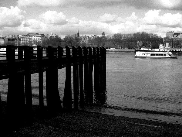
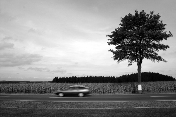
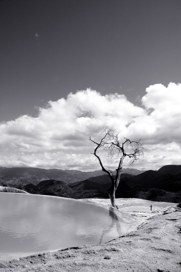
Black and White
In the past, the only form of photography known possible was black and white. With time more advancement was made in the field, and color photography evolved to become the means to document reality as we know it today. But black and white never died.Black and white is a form of art like no other. It starts with documenting the reality around us, but it is stripped of all color to stand on its own two feet triggering emotions and perceptual responses which would not have been made possible otherwise.
The lack of color in monochrome photography gives a whole new degree of importance to form, shape, and texture in a photograph and it makes the urge to frame a successful composition even more essential.
It's also worth mentioning that, black and white photography lends itself well to extreme variations in exposure to create mood and drama. That is because, with black and white there is not the downside of changing colors and shifting hues under varying exposures, which is a thing that becomes of concern in color photography.








Post a Comment